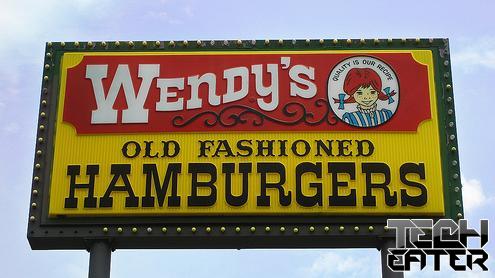
It seems that Wendy’s will no longer be known for their “old fashioned hamburgers”. After 29 years, the restaurant chain’s logo and mascot is getting a makeover. The boxy letters and Western feel of the old logo is being replaced with a softer font and more contemporary look.
According to the AP, the new logo will launch in March 2013 as part of a restaurant redesign that will affect 6,000 North American locations. Restaurants that have already made the switch are claiming a 25 percent increase in sales.
Do you think the new logo is an improvement, or should Wendy’s have stuck with their older and more iconic version?


